Showing posts with label cover review. Show all posts

Saturday, July 6, 2013

Cover Confessions: Throne of Glass Series

Book 2. Yawn.
If you haven't read Throne of Glass by Sarah J. Maas, then this post won't make much sense. So for those who have not read Throne of Glass, you can read my review instead. Or feel free to chime in with your un-book-biased impressions! For all others, feel free to tell me I'm totally wrong in the comments!

Because, I know, I'm totally in the minority here.

So much so that even the publisher decided to take my choice and toss it out in favor of creating a mismatched series (a travesty in and of itself).

And, yes, I know, the new covers are "so badass" and she has swords and stuff and it's illustrated and she looks like a tough fighter and zzzzzzzzz.....

Yes, I admit it. The new covers BORE me. The colors are so bland and they make me think of a graphic novel. All things that would make me ignore the new books if I stumbled across them on a shelf.

I also don't think they fit the series at all.


I know, I know, I can hear the detractors now. This is a series about a badass assassin lady, right?! How can these covers NOT fit the series? Just look at her! She has weapons practically dripping off her body. An initial count turns up four, and that's only after giving the cover a cursory glance.

But that's ALL they show. And Celaena is so much more than a killer.

New cover: Ooooh she's going to kill someone!
Sure she probably looks JUST like that cover picture in a few scenes. Rage burning, weapons out, and a look that says, "I.WILL.END.YOU." There are definitely some scenes like that.

But she's also a girl, and I think that defines her much more than her assassin traits.

She's a girl who likes pretty dresses and swoony romances and glamorous parties and emotional music. She plays with her puppy and has giggly tea parties with her best friend. She eats chocolate cakes (like, the whole cake) and she likes glittery decorations. She frequently indulges in shopping sprees. She loves deeply and she treasures her friends (and, please tagline, she does NOT have a "heart of ice"). These are all the reasons I love her as a character and want to be her friend.

Does the girl on those new covers do those sorts of things? I'm having a hard time seeing her swoon over the prospect of elaborate dresses and bags of candy.

That girl on the first cover, though? SHE I can see doing all those things. Her makeup is perfect, she's curled her hair (and there's plenty of places to hide her stylized hair daggers—can't do that in her flowing new covers hair, can she, hmm?), and there's just something about her that makes me think she'd be down for having a sugar-laden sleepover party.
Old: This is a girl who reads fantasy romance novels

I can also see her tearing apart those who would dare threaten her loved ones. There's something about her that looks like she's been through some things and can hold her own. A wiriness and a wariness.

This all fits the first book extremely well. In Throne of Glass, Celaena had just left the salt mines. She was broken down, thin, and weak. She was still Ardlan's Assassin, but she was rusty.

She spent many memorable months in Throne of Glass training with Chaol (swoon!) to get back to peak form. I can totally picture the girl on the old covers running in the woods with Chaol, puking her guts out, sniping at him (in part because puking her guts out makes her look unattractive, which is something I would SO think about if I were barfing in front of the hot Captain Westfall) and then wishing she could attend a fancy ball.

The girl on the new covers? Not so much.

That new girl doesn't seem like she cares at all what she looks like, what she wears, what songs she dances to, or what sweets she eats. She doesn't look like she harbors any tender or sentimental feelings for anyone. Killing people seems to be her only focus. She seems boring and one-dimensional. Just another "tough girl" in a long boring string of tough girls. I definitely won't be inviting her to any sleepover parties!


Fan art of an actual scene in the book


So, sorry Bloomsbury. Everyone else might love the new covers, but I'm disappointed there won't be any more like the first.


What do you think about the covers?
Love the new ones? Hate the old one?


If you haven't read the books yet, which cover would make you more likely to pick them up?

I know, I know, I'm probably the only one who prefers the old cover, so feel free to tell me why you like the new ones better!

.

Sunday, July 1, 2012

Cover Review: Through the Ever Night

Through the Ever Night by Veronica Rossi


Rarely does a cover grab me so strongly that it makes me drop everything and open up a blogger postbox, but that is exactly what I did when I saw this cover.

Was it the stylish random swirly things he's walking through?

Um, no. Looks like his staring-into-the-distance gaze is going to lead him to trip right over that dangerously placed front swirl. He doesn't know it yet, but he's about to fall flat on his face.  And I'm totally the type of person to point and laugh hysterically (of course I'd give him a hand after I caught my breath).

How about the pretty purple and blue "bruised thunderstorm" backdrop?

Nope, sorry! Though it is pretty and he does look rock-star awesome walking out of those clouds. Anyone ever see the Full House episode where Uncle Jesse was lowered onto stage from the ceiling wearing a leather jacket with foot-long fringe? There was a smoke machine and I think I remember he was told to stick his tongue out ala KISS and act like a vulture (aaah, found it! Here you go).Well, this is right up there on the cool scale as far as dramatic entrances are concerned.

Oh, oh, could it be the super serious tagline?? "A world torn apart!!! A love under siege!!" (exclamation points mine).

Ha, no. Though I'm having a ton of fun clutching my chest and saying the tagline with breathy peril. Or using Deep Movie Trailer Narrator Voice. I mean, really, can we get any more angsty than that tagline?

No, much as these features are all very eye-catching and have provided me with lots of laughter, what drew my eye was that hot eye candy clad in post-apocalyptic leather pants and a scoop-neck pec-revealing clean white shirt.

A world torn apart?? He looks like he's modeling clothes on a fashion runway. I'm also having trouble buying the "love under siege" bit because how can his female lead NOT throw herself at him when he's sporting so much of that shiny toned chest?

Ok, sooo maybe his ensemble doesn't exactly jibe with the post-apocalyptic storyline, but HarperCollins must know my weakness for guys who score high enough on the hotness scale to land themselves a guest spot on The Vampire Diaries (have you noticed the hotness quotient on that show?!). Yet again, HarperCollins gives me a cover that looks like it has nothing to do with the book and makes me want to simultaneously stroke it lovingly and hide it from every single person who might know me or ever know me in the future.


What do you think about this cover?
Do you like it? Dislike it? 
Does it make you want to read the book?


Interested in covers?
Be sure to check out another Cover Crazy post by Gina from My Precious.
    Click here for more of my cover reviews!

Thursday, May 24, 2012

Cover Review: First Impressions (4)


First Impressions:

Toys! Fantasy toys! I want to play!

Now that I've completely lost any veneer of cool I might have had I can freely admit my obsessive desire to own one of those tables old men have in their basements where they spend countless hours recreating set designs of epic Civil War battles with teeny tiny doll-house like figurines, trees, wagons, and cannons.

But instead of the Civil War, I want a fantasy table! One with orcs and elves, heroes with swords, dragons and wizards and all set in a world like Middle Earth! (And, ok, yes, I'll also take a Civil War table too, please).

*cough* Um, so, yeah, that's what this cover makes me think about. I really have no idea what to expect story-wise, but I imagine it contains a good deal of nerdiness mixed with humor and fantasy fun. AKA, my kinda book.

Reality (from Goodreads):

The Other Normals centers on 15-year-old Peregrine “Perry” Eckert, who’s seriously obsessed with an uber-dorky role-playing game called Creatures & Caverns. Concerned about his stunted social skills and need for fresh air, Perry’s parents decide to ship him off to summer camp to become a man.

He anticipates the worst summer of his life until he arrives at camp and stumbles into the World of the Other Normals, a place where his nerdy childhood may serve him well — but not without connecting with the real world first.

Do they match?

Pretty much! Dorkiness + fantasy + a little something that makes me think of Vivian Vande Velde's User Unfriendly and Heir Apparent = SO FULL OF WIN!

This sounds like one of those movies where a kid gets sent to fat camp but then when he gets there he realizes that they pretty much get to spend every day eating cream filled donuts and thumbing their noses at the jerks who sent them there, but for fantasy nerds! Score!


What do you think? Does this cover make you want to read the book? What would you think this book is about if all you saw was the cover? 

Can anyone come up with funny blurbs or taglines for the book based on its cover alone?
Am I alone in wanting a fantasy table of tiny figurines? 

Saturday, April 21, 2012

Cover Review: First Impressions (3)

Moving is totally stressful. So instead of facing more boxes, calling more utilities companies, or even considering my review pile, I'm going to procrastinate by playing guessing games! Want to join me?

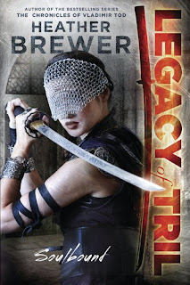
Soulbound: Legacy of Tril by Heather Brewer

First Impressions:

This doesn't look like a book that takes itself too seriously. It's all about looking totally cool while actually being filled with lots of campiness and gigantic stretches of the imagination. I'm fully expecting action-filled fun times.

Just look at the way she's holding that sword! No real swordswoman would even think of holding a sword like that (is she trying to awkwardly slice open her shoulder?). But in her defense, her masochistic pose might be a result of the fact that she can't see anything due to the "I'm so skilled that I don't need to see!" blindfold.

But doesn't she look badass? The random black ribbon on her arm is worth at least 10 cool points alone! Plus, there's magical glowy light coming out of the series title! You can never go wrong with magical glowy light.

Basically, what I'm getting from this cover is that Joss Whedon decided he was tired of his TV shows getting canceled so he is bringing his tiny female killing machines to the world of books. Yay!

Reality (from Goodreads):

"What's worse than being blackmailed to attend a hidden school where you're treated like a second-class citizen? How about nearly getting eaten by a monster when you arrive? Or learning that your soulmate was killed in a centuries-old secret war? And then there's the evil king who's determined to rule the world unless you can stop him...

Meet Kaya, a young woman with the power to heal and the determination to fight. But struggle as she will, she remains tied to three very different men: a hero who has forsaken glory, a tyrannical ruler who wants to use Kaya, and a warrior who's stolen her heart. Kaya learns the hard way that some ties can't be broken...and blood is the strongest bond of all."

Do they match?

Yep, pretty much Buffy. Could I have finally found something to fill the gaping Scooby-Gang void in my heart (other than my annual seasons 1-7 marathon)? *fingers crossed*


Blessed by Tonya Hurley

First Impressions:

Did Amanda Seyfried die and then come back as a demon-possessed zombie with a penchant for prayer? 'Cause that's what it looks like. I wouldn't be at all surprised by scenes of animal sacrifices and soul-pledging to Satan.

I'm expecting a black comedy that will make me feel kind of skin-crawley and ick-ed out. And maybe a little bored, too (doesn't she look bored? She's making me feel bored.)

I know I shouldn't let a bad cover stop me from reading a book, but I don't think I want to touch that book (she looks like she might give me pink eye) and I'm positive I don't want anyone seeing me reading a book with that cover.

I'm also pretty sure 1995 called and wants its style-challenged cover back. All she needs is a black choker and the look would be complete.

(And, ok, yes, 1995 wants its insult back, too. But in my defense, at least I'm actually from the '90s. What's this cover's excuse, hmm?)

Reality (from Goodreads):

A "re-imagined redemption remix", following three teenage girls in Brooklyn and drawing on the martyrdom legends of St Lucy, St Cecelia and St Agnes.

Do they match?

So no zombies but a strong likelihood of dead girls. I'm not really sure how a "re-imagined redemption remix" with saints will work, but if that cover is any indication, it will be weird and maybe not for me. Also, she looks more anti-christ than saintly.


What do you think? Do these covers make you want to read the book? What would you think these books were about if all you saw was the cover? 

Can anyone come up with funny blurbs or taglines for the books based on their covers alone?


Independent Book Blogger Awards
Vote for this blog for the Independent Book Blogger Awards!Vote


.

Thursday, March 15, 2012

Cover Review: Daughter of the Forest


Daughter of the Forest by Juliet Marillier

A little while ago I wrote a Spotlight List called Fantasy Authors I Should Have Read about fantastic fantasy authors I somehow (shamefully!) managed to have missed out on reading. This list included Juliet Marillier and many wonderful commenters raved about her book Daughter of the Forest. And I totally trust you. So much so, that I went and bought a copy when I saw it for sale.

But, of course, I still haven't read it! I wonder if part of that has to do with the fact that I kind of hate the cover. I'm sorry, but it's true! I've since read and loved Wildwood Dancing, so I'm pretty confident that I'll love Daughter of the Forest, but THAT COVER. Nope, I just don't like it.

You can click on all of these pictures to make them larger so you can get the full impact.

First, here it is in all it's glory:


I'm feeling a whole lotta meh. It's all washed out and faded looking. I'm totally superficial and I like shiny, bright new things. The colors on this cover make it look old and boring. I can almost smell that musty old book smell (which I hate, sorry), but this is an almost new and entirely musty-odor-free book.

I'm sorry to say, but the colors aren't the only thing working against it. Let's break it down and analyze all the pieces.


Swirly header/footer things:


These are good. I don't think you can ever really go wrong with swirly things on covers. They're just pretty. The colors here could use a boost of, well, color, but the swirlyness of it all still manages to score it some points. Yay for that.

Title treatment:


Things could be worse here. But they could also be a lot better. There are barely any swirls, which is an automatic point reduction. The D hardly counts. The rest of the font is just plain old whatever and while it doesn't score negative points, it isn't gaining any points either.

But what the heck is that F??? That's just a little too ye olde castle for my tastes. We're not in the 1980s anymore. Plus, it doesn't match....anything. This brings the title treatment to an overall NEGATIVE point score.

The swans:


Ok, so the colors are still pretty bleh here, but swans get automatic points because they're graceful and beautiful and next to ponies and unicorns they are practically the number one animal embodiment of princessy wonderfulness.

(Or, you know, magically cursed princes. Which is what that swan probably is, seeing how this is a Six Swans retelling). 

The girl:


Are you kidding me??? This is worth about a million negative points right here. I've said I can be superficial, right? Well, I am. This girl isn't ugly, but she sure isn't gorgeous either. And that hair! Honey, get yourself some frizz-controlling shampoo!

Oh, they don't have that in this world? You know what they do have? Magic. And if I had magic, you'd better believe I'd be using some of it on my own frizzy hair. 

And that "dress"! Sure we may be inundated with beautiful dresses on covers, and fine, maybe they are becoming a little trite. But you know what? They're pretty, and pretty trumps trite every time.

But does this girl have a pretty dress? Noooo, she has a sack. An ugly, drab, sack of a dress with unflattering folds and a weird shoulder covering thing. Fail.

(I don't care if she's focused on weaving painful nettle sweaters to save her brothers' swan-sucked souls. Can't she weave while wearing silk???)


So, what do you think about this cover?
Do you like it? Dislike it? 
Does it make you want to read the book, or are you totally superficial like me? 

(and, I know, I know, the book is much better than this awful cover would imply. Don't worry, I'm still going to read it. Someday.)


Interested in covers?
Be sure to check out another Cover Crazy post by Gina from My Precious.
    Click here for more of my cover reviews!

Friday, November 25, 2011

Cover Review: First Impressions (2)

If I saw these books on the shelves, I would totally want to read them based on their prettiness alone. But a pretty cover doesn't always tell you what the book is actually about, does it?


Initial thoughts: *Jaw drop* Beautiful! The flowers and dress are so pretty. I love how it's illustrated and almost looks like a comic book. Ooooh, look! A mummy!

What I expect: British lady, mummies, mystery, and romance. Looks like it will be a light and fun book.

Magic? Probably a little. I'm getting "magic curses" vibes from that mummy.

Historical? Totally, just look at her dress!

Reality: This was a light and fun story, but it had a much younger tone than I was initially expecting (more younger YA/MG than the solid YA I thought it was). There is a touch of magic and it does take place in England. Overall, the cover gives a pretty good idea of what the story is about. 


Initial thoughts: Love that dress! What is she running away from?  

What I expect: I don't really have much to go on, but she looks like she's running away from something, so I guess I expect persecution of some sort?

Magic? Something about her makes me think she's a witch, but other than that this cover really doesn't scream "I HAVE MAGIC!!"

Historical? Yes, this feels like an historical, even though I can't place when that dress would have been in fashion. For some reason I get a Salem witch trials feel from it all, but I don't know why because they certainly wouldn't have been wearing dresses like that then.

Reality: She isn't a witch (though she does have magical powers), she isn't being persecuted, and this doesn't take place during the Salem witch trials (though it is set in the past and in America). The tone of the book doesn't really match the movement or immediate distress of the cover, but it is a darker story and I do get a sense of that darkness from the cover.

Initial thoughts: Pink! Flower! Pretty!

What I expect: A story rich in atmosphere with lots of description. The position of her hands make it look like she's offering the flower, so maybe there is some similar offering in the book?

Magic? The bright colors seem magical, but other than that, no, there isn't anything that would lead me to think magic is a part of the plot.

Historical? Probably. Set in India.

Reality: While the cover image doesn't really reflect the central role magic plays in the plot, it does totally capture the lush atmosphere and Heather Tomlinson's immersive writing. I think it's a good match.


Initial thoughts: Swirly snow! I love stormy, wintry weather.

What I expect: Russia! Something fun, but also maybe a little serious too like the Gemma Doyle trilogy. I definitely get an "impending storm" vibe, which is exciting but also makes me wonder if there's a cliffhanger.

Magic? Maybe! That swirling snow looks like it has a magical twinkle, don't you think? 

Historical? While it's possible it could take place in modern times, my money is on historical.

Reality: The tone of the book matches my impressions (light, but also serious) and the pieces are definitely being put in place and the storm "gathering" in this installment. There are fantasy elements, but the paranormal smorgasbord of vampires, spellcasters, and necromancers is not made apparent by the cover. It does take place in Russia though (during the late 1800s). 


When you look at these covers, what are your first impressions? How do they line up with what the book is actually about?


Remember those "almost historical fantasy" books we mentioned in our discussion post? The "generic medieval village" and similar "Anything Goes-er" books? Ruby has a list of some of her favorites to share with you today! Stop by to see what she's picked and share your favorites!

Have you entered to win our prize pack giveaways?

Sunday, November 20, 2011

Cover Review: First Impressions (1)

If I saw these books on the shelves, I would totally want to read them based on their prettiness alone. But a pretty cover doesn't always tell you what the book is actually about, does it?


Initial thoughts: Oooh pretty! I want that dress. And that fan. And that gold shawly-thing. And that headband jewelry thing. And what do I need to do to get my hair to look like that? Want, want, want!

What I expect: Court gossip, scandal, and juicy secrets. Just look at the way she's peering over that fan! She is totally up to something.

Magic? Never would have guessed by the cover alone.

Historical? Oh yeah, that's obvious.

Reality: A light romp through Disney-sweet romances and magical fun. There is court intrigue, but it is not nearly as scathing as I originally expected.Oh, and it's about twin sisters, which I never would have guessed based on the cover.


Initial thoughts: Can I get a print of that to hang on my wall? I could stare at this cover for hours

What I expect: I have no clue. Fairy tale retelling, maybe? Fairies? A touch of romance?

Magic? Probably, though I'm not really sure what kind. I'm leaning toward the fairy godmother, witches, or fairies type of magic though.

Historical? Maybe, or maybe just the "generic medieval-like village" found in fantasies.

Reality: I don't know exactly since I haven't read the book yet, but it is described as a "Snow White tale filled with magic and intrigue during the early twentieth century in Appalachia," so pretty close to my initial impressions.


Initial thoughts: I like the flowers in her hair, and you can never go wrong with swirly fonts. The colors are pretty. I'm intrigued.

What I expect: She looks a little, erm, loose for an historical gal--is that what's wicked? I don't really know what to expect, but I want to find out more. I get a strong feeling that there will be some kissing going on!

Magic? The branches at the bottom and her eyes make her look a little witchy, but it's a very subtle vibe. The subtitle at the top that says "The Cahill Witch Chronicles" is a bigger tip off.

Historical? Her clothing makes me think no (a skirt that high? That's a little more daring than showing a bit of ankle), but the cover has a "not of this time" feel to it, so maybe?

Reality: Again, I haven't read this yet, but I know it takes place during the 1890s in an alternate New England and includes witches. So a moderately accurate cover, but definitely effective at catching my eye.


Initial thoughts: Pretty purple dress! A pun! I love puns, and purple, and pretty dresses. I'm sold! Also, she looks like Rachel Lee Cook and now I feel like I need to re-watch She's All That.

What I expect: Honestly, I don't. I'm still stuck on the pretty to give much thought to plot. Maybe it's a biography about Jane Eyre, like that movie Becoming Jane was for Jane Austen? Except, Jane Eyre is a fictional character, so that doesn't work. I don't know, can I just keep looking at the pretty?

Magic? Her dress does seem to have a magical glow to it, but no, I don't get strong magic vibes. 

Historical? Yep, I fully expect an historical story with all of the balls, courting, and manners that entails.

Reality: Haven't read this yet either, but I do know it's about a modern girl who finds herself sucked into the story of Jane Eyre (and into Jane's body!). I haven't read Jane Eyre yet, but she's a governess, right? So I'm not so sure how many balls there will be, but I do know there's probably a hot brooding guy!


When you look at these covers, what are your first impressions? How do they line up with what the book is actually about?


What's Ruby up to today? Check out our Historical Fantasy Jubilee full schedule of events and giveaways!

Have you entered to win our prize pack giveaways?

Saturday, November 19, 2011

Cover Review: Grave Mercy


Grave Mercy by Robin LaFevers


Seven reasons you like this cover...

...and why that means you're going to love Grave Mercy


You zeroed in on PRETTY DRESS

It's pretty fabulous, isn't it? It's all flowing and red, and it actually looks like it came from the past and not a prom catalog. Ismae has a few notable scenes where she gets to dress up in pretty dresses I wish I owned.

This dress also has presence, and unlike many "pretty dress" covers, this dress doesn't seem like it will hamper Ismae's ability to use that crossbow.

Ok, so maybe running is out, but Ismae isn't the type to run an hide anyway. Plus, imagine how many weapons she can hide in those folds? And I promise you, she does.


You're tired of damsels in distress

If your interest was piqued at the sight of a female lead toting a giant "Don't Mess With Me" weapon, then you're in for a treat.

Ismae is an assassin, and this point is driven home on multiple occasions. That crossbow? It's only a small part of her arsenal--an arsenal she makes full use of throughout the book.


You want to live in a castle

Come on, be honest, when you looked at that castle, did a tiny part of you cry out, "Mine!"? Or was that just me?

Ismae spends most of the book inside a castle as she tries to figure out which one of the guests is a viper in disguise.

You like historical settings

Doesn't that font scream "historical"? Grave Mercy takes place in medieval France and the historical setting is definitely a presence (though not at all in a boring, overly-detailed way).


You want more than a Barbie

No question, the cover model is pretty. But she's not gorgeous in that "I don't want to stand in a room with you because you're so overwhelmingly beautiful" kinda way either.

And that's Ismae. Her looks don't monopolize anything. As it should be.

You're not going to be bored with the YA cliches of Ismae talking about how plain she looks (while simultaneously attracting the eye of every single male character in the entire book), nor will you be bombarded with reminders of her shinning hair and porcelain skin.

But don't fear, someone will find her attractive...eventually (*hint* *hint* Do you remember what kind of romance I love?)

You're not one to take things lying down

Does this tagline need any more explanation? If you like the sound of it, then I have a feeling Ismae and Duval will be your new best friends.

You know a storm brewing when you see one...and you like it!

Check out those clouds! I don't need to be a meteorologist to figure out that some nasty weather is rolling in. Darkness swirls around Ismae in the story, too, with dastardly plots closing in on her from multiple directions. But see that brightness behind her? See that strong stance and determined look in her eyes? Yep, Ismae is SO going to bring it.


Remember that book pushing I promised you? Well, it starts today! Check out Ruby's Reads today to learn more about Grave Mercy and enter for a chance to win an ARC! 
(Heads up, the ARC copy doesn't have this gorgeous cover, but it is cool and looks like this.)


Check out our Historical Fantasy Jubilee full schedule of events and giveaways!

Have you entered to win our prize pack giveaways?

Sunday, August 7, 2011

Cover Review: Jason Chan

Cover Crazy is a weekly meme hosted by Tawni at The Book Worms where a beautiful cover is featured each week for all of us to admire. I am going to use my Cover Crazy posts as an opportunity to review a book cover I love or review any cover (even the ones I don't love) from a book I've read. This week's Cover Crazy is for:  

Artist Spotlight: Jason Chan

You may not know the name Jason Chan, but I'm sure you're familiar with his work. He's among one of my absolute favorite cover artists and features a very unique style. Though illustrated, his covers have an almost photographic feel to them. I especially love the way he uses color and light. Here are a few examples of his work that I particularly like:


Which cover is your favorite? Do you have a favorite Jason Chan cover I didn't include? Do these covers make you want to read the books?


Interested in covers? 
Be sure to check out another Cover Crazy post by Gina from My Precious.


Want to check out another Artist Spotlight post?
More of my Cover Crazy posts

Related Posts Plugin for WordPress, Blogger...